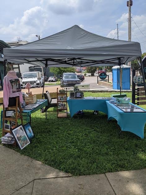
Booth Design
My first booth in 2021, very disorganized.
Market Research
Every market is a wonderful opportunity for market research.
Every time I set up, I take a step back from my booth to assess and reassess. I take a few steps back, I enter from the left, I enter from the right, I stand 5, 10, 20ft back and see how attractive it looks.
When I pass by a retail shop, I look in the window and see a display. Based on the strength of that display, I may or may not enter a shop I have never been in before.
My booth is my shop and I am trying to attract customers. There are a few key things people are drawn to: Light, Height, Signage and Simplicity.
LIGHT
Be aware of when the sun sets, if there will be lighting provided, or if you will need to provide your own. Be prepared. Be self-sufficient.
Creative use of light.
Night Market
Height
My art is flat. The paper is flat. My display, however, is not.
People’s eyes go up and down when they look at new things. It may sound simple, but designing a display with height in mind is key.
It has taken so long for me to really understand this and I have yet to truly be satisfied with my grappling of it.
In the beginning, I just laid my art on the tables and hoped for the best. I still made money, yes, but it was not an aesthetically pleasing or attractive way to display my pieces.
Good
Bad
Signage
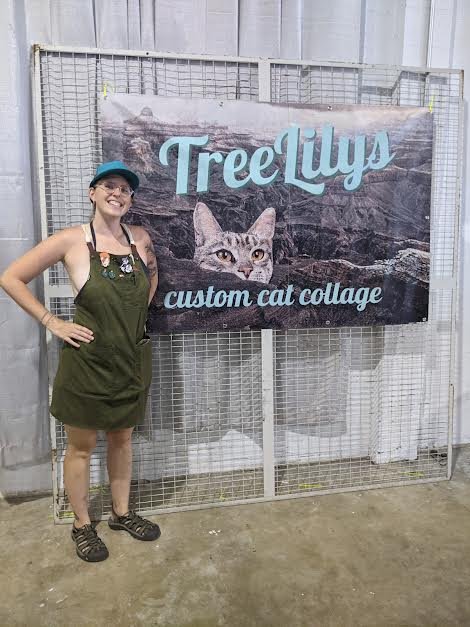
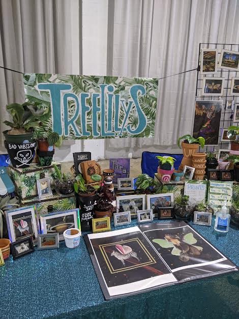
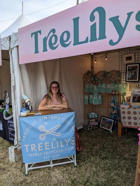
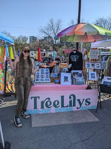
Tell people who you are! It is so important to have a clear and legible sign proclaiming your brand and personality.
I have had several different signs since I started. Don’t be afraid to change. Here are several different iterations of my sign:
Simplicity
I used to travel with three tables. This was not ideal. It took forever to set up. It made my set up time about two hours. It was a nightmare.
I simplified my set up to take about an hour. I learned to work smarter, not harder.
Too complex.
Simple.


